A visitor forms an opinion of your company within seconds of stepping out of the lift. Long before anyone has seen a balance sheet or sat through a pitch, the reception area has already done the talking. It is the smallest space in most fit-outs, and the one that gets remembered the longest.
What reception design is actually doing
A reception has three jobs at once: it welcomes a visitor, it tells them something about the company before a word is spoken, and it manages the practical flow of people, deliveries and security into the rest of the floor. Good design handles all three without the space feeling like three separate problems bolted together.
The elements that carry the most weight
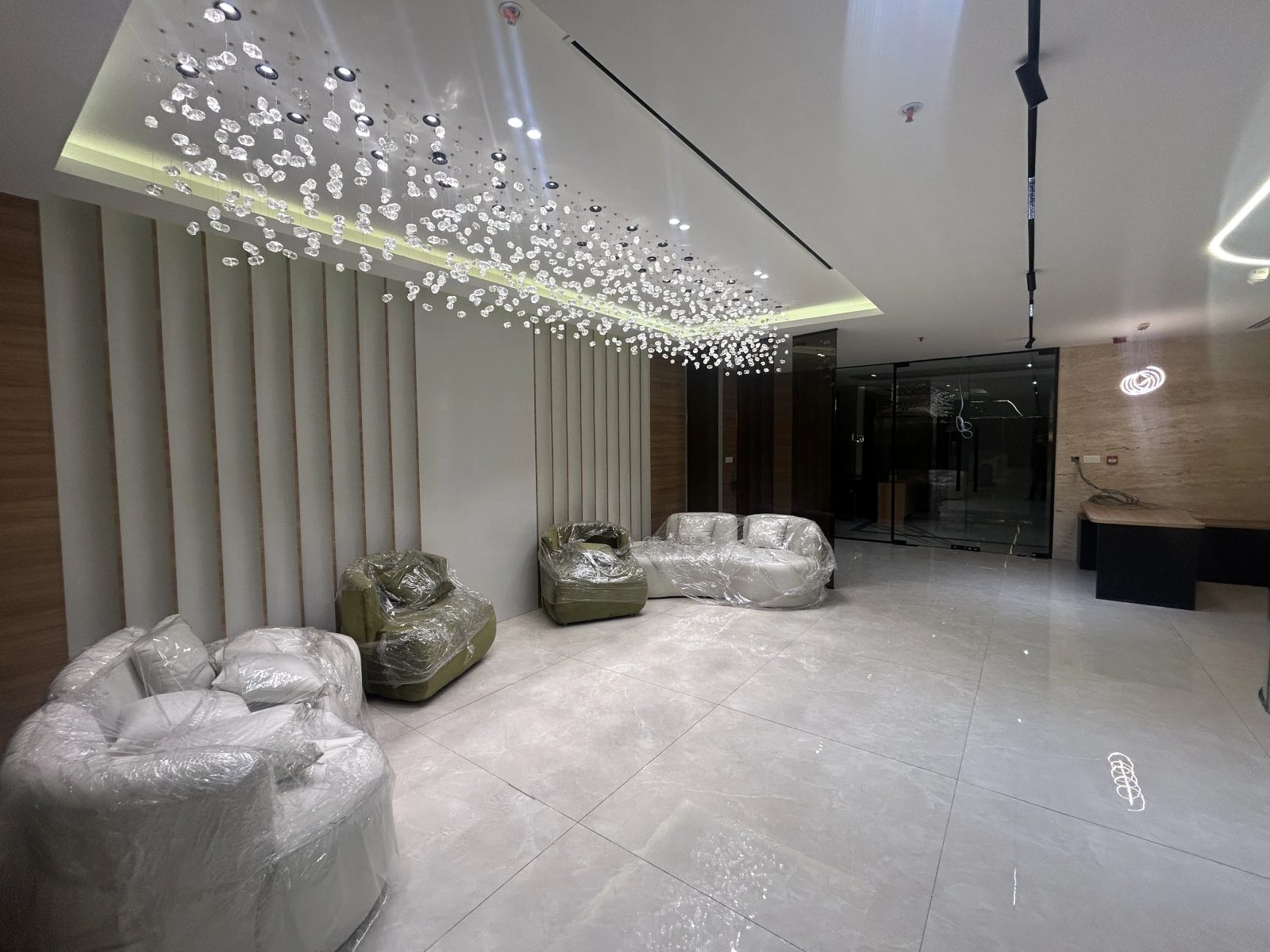
- Lighting. A single considered lighting feature, a pendant, a linear cove, a sculptural fitting, does more for how a reception feels than almost anything else in the room. Flat, uniform office lighting reads as functional; a designed lighting moment reads as intentional.
- Materials at eye and hand level. Stone, wood veneer, or a textured wall panel behind the desk signals quality more directly than square footage does. These finishes matter most where a visitor's eye actually rests: the wall behind the desk, the desk front itself, and the floor near the entrance.
- Seating that isn't an afterthought. A waiting area is where a visitor spends the most unstructured time, often while nervous before an interview or a pitch. Comfortable, well-placed seating, with somewhere to set down a bag or a laptop, changes how that wait feels.
- Brand presence, kept understated. A logo wall works when it's one considered element, not the loudest thing in the room. Restraint reads as more established than a reception covered in branding.
- Clear sightlines for security and flow. The reception desk should let staff see the entrance and any waiting visitors without craning, and the route from entrance to lift lobby, meeting rooms and the rest of the floor should be obvious without signage doing all the work.
Where the budget should go
Reception is a small area, typically 3 to 6 percent of a floor's total square footage, but it is worth a disproportionate share of the design attention and often the finishes budget too. A common mistake is spreading the interiors budget evenly across the whole floor, which leaves reception looking no different from a corridor. Spending more per square foot here, and slightly less in lower-visibility back-of-house areas, usually produces a better result for the same total cost.
Planning a project like this? Officea Design & Build will prepare a costed proposal for your office, free of charge.
A short reception checklist
- One deliberate lighting feature, not uniform downlighting throughout.
- A considered material behind and in front of the reception desk.
- Seating for at least two to four waiting visitors, with a side table or shelf.
- A clear, short sightline from the desk to the entrance.
- Branding kept to one strong element rather than several competing ones.
- A plan for where deliveries and couriers go, so they don't cross the visitor waiting area.
None of this needs to be expensive to work. It needs to be considered as its own design problem, with its own budget line, rather than treated as leftover space once the workstations and meeting rooms are planned.
Officea Design & Build designs reception as a distinct part of every office project, not an afterthought once workstations and meeting rooms are done. You can see examples of our reception work in our project gallery.
Planning an office project?
Officea Design & Build plans, designs and builds corporate offices across India under one contract. See our work or the full list of design and build services, or tell us your city, approximate area and target move-in date below and we'll prepare a costed proposal.